
Oliver Tatom
ABOUT THE PROJECT
Campaign branding for Oliver Tatom’s 2022 run for Deschutes County Commissioner, alongside print design for his community projects.
MY ROLE
Logo design, typography, layout, and artwork for campaign and community materials.

PROJECT SCOPE
Two-color logo · Campaign buttons · Panel ads · Fire Board door hanger
THE BRIEF
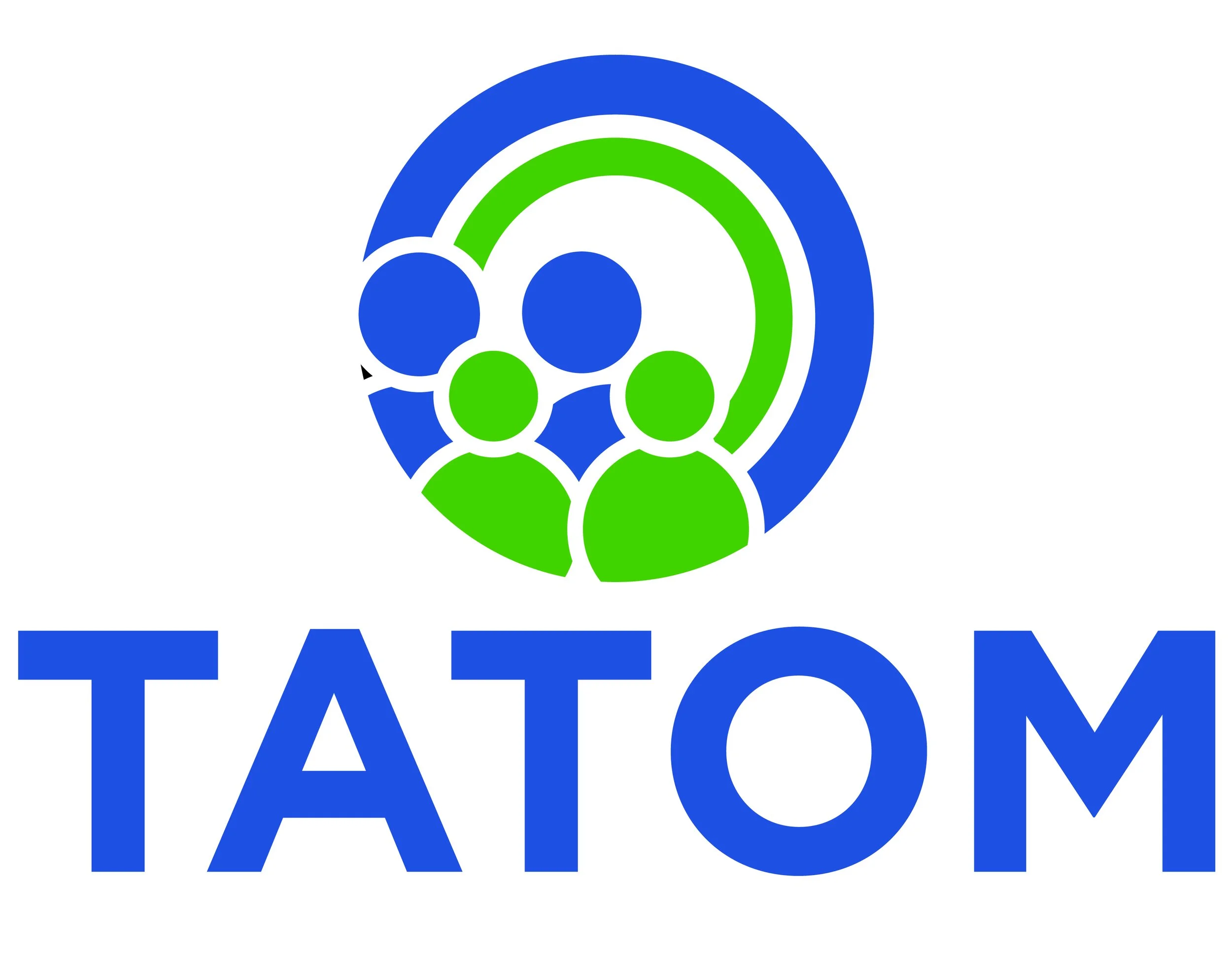
Make Oliver’s name easy to read at a distance, with organic shapes that communicate compassion and optimism. The identity needed a distinct direction beyond the mountain and tree imagery common in Central Oregon.


A name-led campaign identity
Readability first
The lettering gives the name prominence, while a people-centered symbol within the “O” connects the identity to Oliver’s emphasis on caring for others.
A focused visual system
Blue and green keep the palette to two colors. The rounded symbol provides a softer counterpoint to the bold lettering, carrying the brief’s optimism without relying on a landscape motif.
From concept to application
The sketches and refinements show the identity taking shape. The finished examples include the campaign logo and button, alongside panel ads and a door hanger from my broader work with Oliver.
-

Deschutes County Commissioner Logo
-

Campaign Button Design
-

COVID Medical Panel Ad
-

2020 Election Panel Ad
-

Door Hanger Design » Fire Board